
Redesigned a student website improving navigation, accessibility and student experience.


Overview
Student Accessibility Services (SAS) helps York University students access academic accommodations, support, and accessibility resources.
However, finding the right information on a university website can be difficult. Important details may be spread across multiple pages, making it harder for students to understand the services available and where to start.
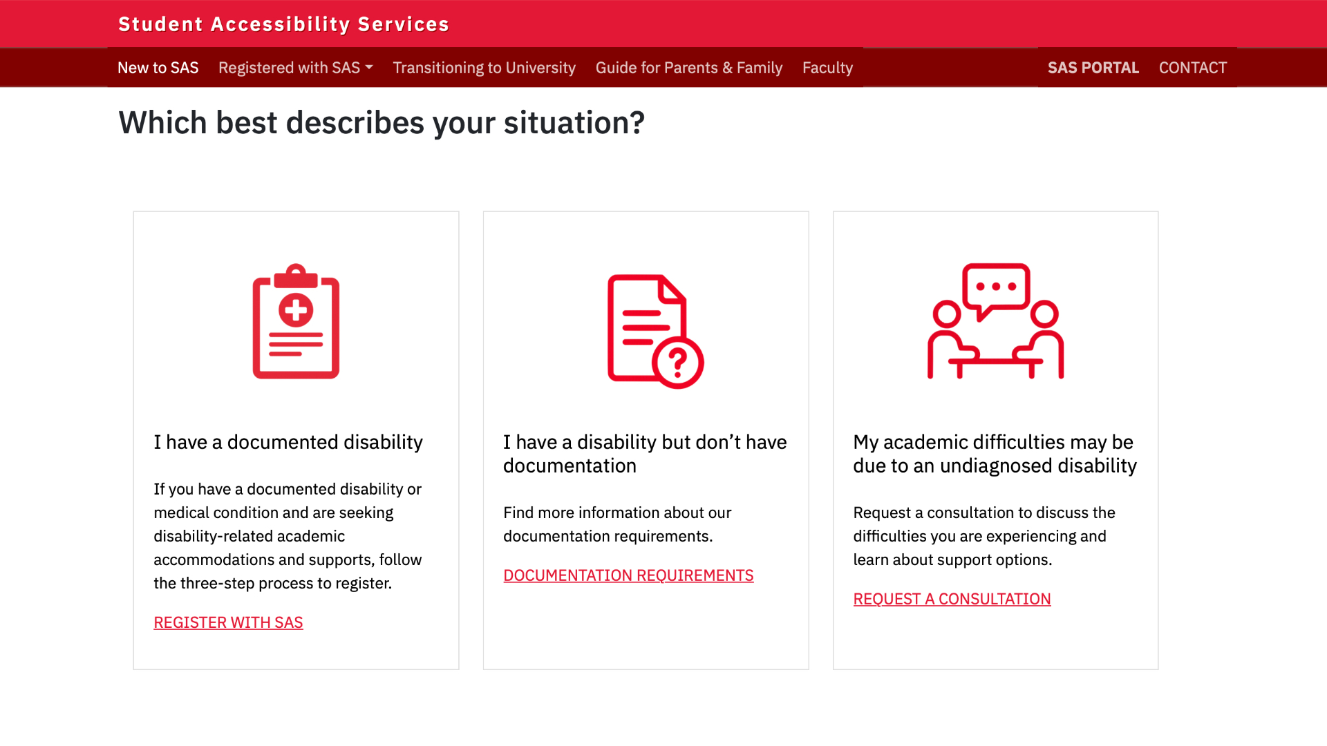
As part of York University's VPS Communications team, I am contributing to the redesign of the SAS website. My focus is on making the website easier to navigate, improving how information is organized, and creating a more accessible experience for students.
The Problem
The existing website presented opportunities to improve how students find and navigate information.
With a large amount of content and different services to explore, students may have difficulty finding the information they need or understanding what steps to take next.
The redesign focuses on five main areas:
- Navigation: Making it easier to find important pages and services.
- Content: Organizing information so it is easier to read and understand.
- Structure: Creating a clearer layout for the website's pages.
- Accessibility: Making the website easier for everyone to use.
- Consistency: Creating a more consistent experience across the website.
Goals
The goal is to make the SAS website easier for students to use.
The redesign focuses on five objectives:
- Simplify navigation: Help students find important information more easily.
- Organize content: Group related information in a clear and logical way.
- Improve readability: Make content easier to scan and understand.
- Improve accessibility: Follow accessibility guidelines and remove barriers.
- Create consistency: Use a consistent layout and design across pages.
My Role
As part of York University's VPS Communications team, I contribute to the UX and development of the SAS website.
My work includes:
- Reviewing the existing website and its content.
- Identifying areas where navigation and usability can be improved.
- Updating the website's sitemap and page structure.
- Organizing content to make information easier to find.
- Applying accessibility guidelines to design and development decisions.
- Working with team members to support the redesign.
Process
Reviewing the Existing Website
I started by reviewing the existing SAS website to understand how its content was organized and how students could find important information.
I looked at the navigation, page structure, and content to identify areas that could be improved.
This included:
- Reviewing the existing sitemap.
- Looking at how pages were grouped and connected.
- Identifying areas where content could be better organized.
- Finding opportunities to simplify navigation.
- Considering accessibility improvements.
Organizing the Website Structure
One of the main parts of the redesign was reviewing and improving the website's sitemap.
I looked at how information was grouped and how different pages related to one another. The aim was to create a clearer structure that makes it easier for students to find the right information.
Improving Navigation and Content
With the website structure in place, I focused on making the content easier to navigate and understand.
This included:
- Using clearer navigation labels.
- Grouping related information together.
- Improving page layouts and content hierarchy.
- Making important information easier to find.
- Creating a more consistent experience across pages.
Improving Accessibility
Accessibility was considered throughout the redesign.
I focused on making sure the website could be used by students with different needs and abilities.
Key considerations included:
- Clear heading structures.
- Readable text and sufficient colour contrast.
- Keyboard-friendly navigation.
- Descriptive links and buttons.
- Accessible page layouts.
- Following WCAG accessibility guidelines.
Design Direction
The redesign focuses on creating a clean, simple, and consistent experience.
The goal is to make information easier to find without overwhelming students with unnecessary content or complicated navigation.
The design also follows York University's digital standards while keeping accessibility and usability at the centre of the experience.
Conclusion
The SAS redesign focuses on making it easier for students to find information and access the support available to them.
By improving the website's structure, navigation, content, and accessibility, the project aims to create a clearer and more useful experience.
A good website should make finding support easier, not harder.
